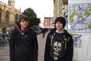
 photograph No.1 - Assassin watching the Main character and the Teacher
 The things I edited in this image was the brightness/contrast and exposure. The process I went through to change the picture, I Adjusted the brightness to -23 to make it darker, then the contrast to 48 to reveals some more of the dark line edges in the photograph. The exposure was set to 0 but the offset was set to -0.0041, gamma correction at 1.07 to add a bit of brightness to the picture, realising the image was to dark. Then finally adjusting the curves to Output 171 and input 154 to sharpen the image.
 Photograph No.2 - Main character and Teacher walking
  This picture was slightly simpler to edit because I only adjusted two things with the image using the element: Brightness/contrast and Curves. The brightness was set to 21 to make it brighter and the contrast was set to 29 to reveal some of the dark edges that were on the photo. The curves were adjusted to Output 146 and the input 185 making the image slightly darker because I had made a mistake in making it too bright.
Photograph No. 3 - Main character looking at a leaflet
In this photograph there wasn't many changes made to the picture only the curve levels for the picture were changed to reveal a bit more colour in the photograph. the Curve Output was set to 169 and the Input was set to 170.

Photograph No.4 - Main character meeting the teacher at his house
 This photograph as a matter of fact started out as two separate images and they were edited together in Photoshop. The magic wand tool was used on both of the images to remove any negative space in the image, then image: DOOR, was added behind the main character but in front of the teacher character. The inside of the door frame was cut out so the teacher character could be seen. Image: wall texture was added so the background looked like a real life wall was there. Then image: DOOR NUMBER was added so that it was clear to the reader that this was a apartment not just a random door along a wall. Final the brightness and contrast was adjusted to make the image come to life a bit.
Photograph No.5 - Main character and Teacher preparing to breach a room
 This image was edited a lot to make it look like a really dirt a grotty place the sort of place you wouldn't go. First the image was cropped to remove some negative space. Then the, magic wand tool used to remove the existing background. Then I added in image BRICK WALL AND DOOR so that the characters were not just floating on the image. Then Image COMBAT KNIFE was added because the characters are carrying knives in the shot but due to legal issues the knives had to be edited in. Finally the brightness and the contrast was adjusted to bring forward some of the colours that were hard to see in the photo originally.


